

When you hire BZD we become your full-service design partner, creating graphics to drive your message and power your campaign. Check out this end of quarter appeal featuring a BZD-designed graphic:

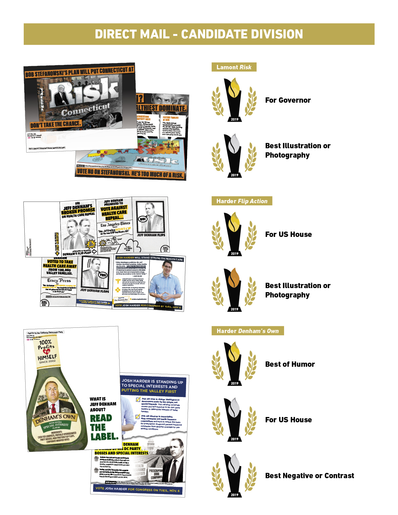
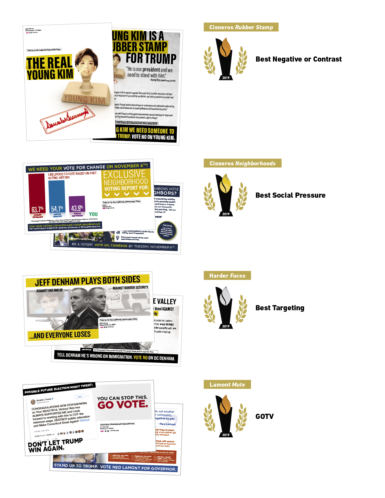
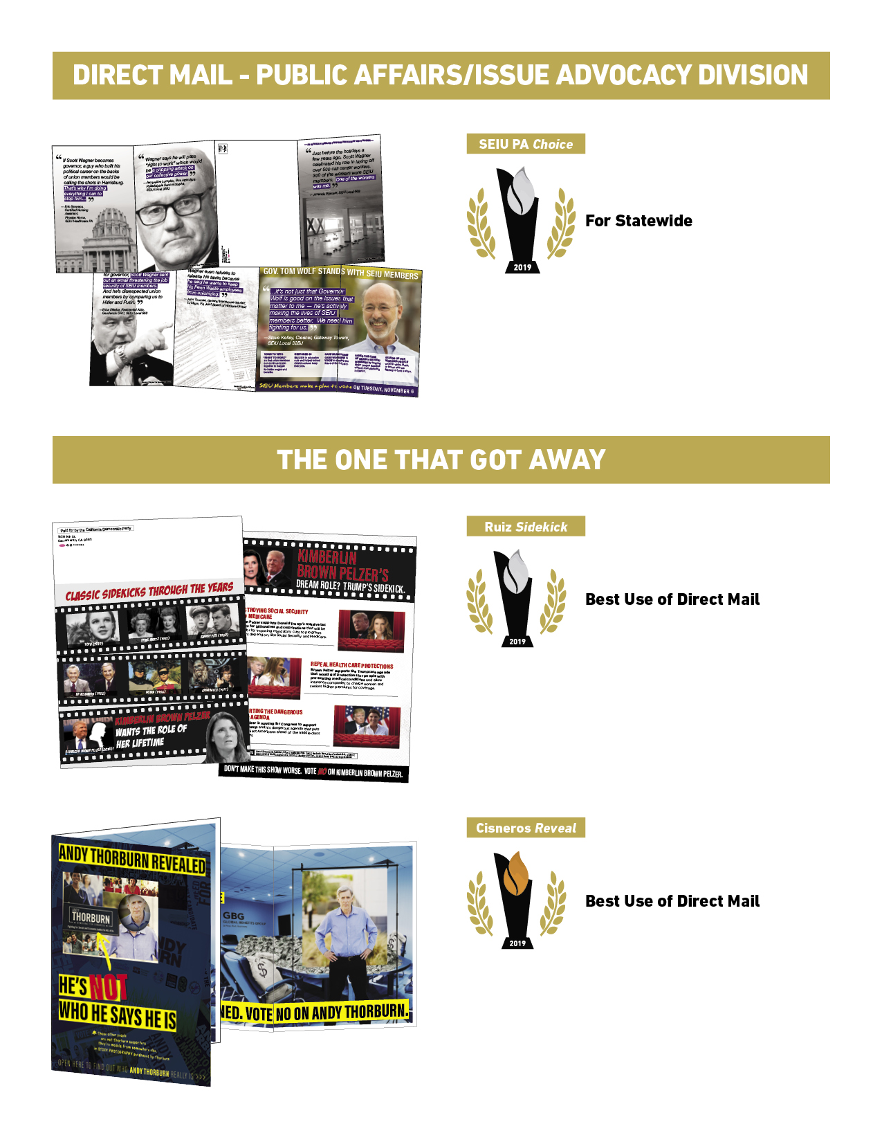
BZD Wins 15 Awards at the 2019 Pollies
News from BZD: Aaron Fisher joins the firm as senior strategist
Bergmann Zwerdling Direct announces hiring of Senior Strategist Aaron Fisher
Ohio native, legislative campaign expert will help lead BZD's legislative caucus programs
COLUMBUS, OH - Bergmann Zwerdling Direct, one of the premier Democratic strategy and direct mail firms in the country, today announced the hiring of Aaron Fisher as a senior strategist. Fisher most recently served for five years as the executive director of the Ohio House Democratic Caucus.
A native of rural Ohio, who has worked on and managed legislative campaigns for over a decade, Fisher led the caucus team that flipped six Republican seats in 2018, the first time in ten years Democrats made gains in the Ohio House. At BZD, he will work with legislative campaigns and expand the firm's legislative caucus portfolio.
"I am thrilled to continue to focus my work helping elect Democrats to chambers where laws that effect millions of Americans get made," said Fisher. "I am proud to now be a part of a great BZD team that is in this fight for the right reasons and puts clients first."
"Aaron's midwestern and state legislative experience will be of great value to BZD, and we look forward to the new perspectives he will bring to the team," said Achim Bergmann, a founding partner of BZD.
"Few operatives in America have Aaron's deep understanding of legislative campaign and legislative candidate recruitment. He will be a tremendous asset to our clients," said BZD founding partner Alex Zwerdling.
Fisher is based in Columbus, Ohio and is a Cleveland and Ohio State sports fan, as well as an avid tennis player.
###
The Challenge of Democratic Caucus Direct Mail
For five years I had the pleasure of serving as the Executive Director of the Ohio House Democratic Caucus, overseeing the political program to elect Democrats to the state’s ninety-nine Ohio House seats. Caucus work is both rewarding and challenging as staff and leadership focus on everything from candidate recruitment and management, to fundraising and paid communications.
One of the most pressing challenges of caucus work, however, is developing an effective direct mail program that is custom-tailored to each individual candidate and district. Considering the number of races a state caucus invests in as well as limits to their budgets, it is critical that scarce resources are spent efficiently. The demographics of a legislative district will vary dramatically within a state, which means a “one-size-fits-all” approach will leave a caucus with fewer victories on election night.
A successful state legislative mail plan will begin many months before the first piece hits mail boxes, as early and thorough research into the candidate and the district lays the groundwork for the narrative that a mail piece will tell. Arguably, this early attention to detail is the most important part of the direct mail process, providing a solid foundation that will lead to more memorable and effective mail.
It is no secret that state legislative candidates receive significantly less attention and resources than those races higher on the ballot. This means that, in addition to focusing on the most pertinent issues within a district, caucus direct mail should also be creative and memorable. Investing time into the creative process in order to deliver unique mail pieces across legislative districts will set a Democratic caucus apart from its Republican counterparts. It is not enough to simply understand what messages will be most effective within a state legislative district, as the delivery of those messages is just as important.
Even on a limited budget, a thoughtful and custom-tailored mail plan can help to push a candidate across the finish line, and state legislative caucuses will be well-served to prioritize an innovative mail plan as they develop their paid communications plan.
Yellow is the New Red White and Blue
Following the 2018 midterms, the Washington Post attempted the first-ever aggregation of an entire elections' cycle’s campaign logos to a single web page. The Center for American Politics and Design (CAPD) set this herculean precedent.
BZD’s senior graphic designer Christopher Mattox reached out to Susan Merriam, co-founder of the CAPD research group, to learn more about what it took to compile the logos and her thoughts on the role of color in branding political campaigns heading into the 2020 presidential election. And Christopher asked how CAPD could possibly want to do it again.
Christopher Mattox: 900 Logos! Who and what is CAPD and what was the process like of aggregating that huge number of logos!?
Susan Merriam: CAPD began on October 2nd with a casual chat over drinks with a handful of designers fascinated by the political logos of the 2018 midterms; we decided on that day to create the site and aggregate the logos. We then had slightly over a month before the November elections to track down each logo and catalog the descriptive information. Inevitably, we spent many of our evenings and weekends in October, on our laptops searching for logos on candidates’ websites and social platforms— sometimes a harder task than you’d think. At one point, we were trying to flesh out the final few missing logos for the the database and we reached out to candidates directly whose materials were not online. One of the responses we received was [we have] “no logo, we’re more of a porch and cider campaign”.
CM: There has been a lot of discussion here at BZD about the awesome Washington Post infographic in the article that shows every single color used in the 900 logos. The graphic makes it so evident: the core reds, whites and blues shared by Republicans and Democrats alike. Equally clear though is the Republican reluctance toward the bold yellows, oranges, and purples Democrats are using. Our logo for Gil Cisneros, halfway down CAPD home page, used gold! What was it like sharing your research with The Washington Post? And What was it like for you to see that infographic for the first time?
SM: Chris Alcantara of The Washington Post reached out to us the day we launched and wanted to access our dataset for a potential piece; it was very exciting to receive that email and their piece is a great use of our dataset. Ultimately at CAPD, we want to foster further dialogue and analysis about the role of design in the political landscape and this is a quintessential example. Chris has mentioned online after the article came out that in order to fact check our work, he had to go through logo by logo, “line by line” to “double check the colors” and used ObservableHQ to create the visualizations. I personally like to collect infographics I find in newspapers, books, etc. so I love it! It’s great way to see the colors in a snapshot. At CAPD, we actually plan going forward to produce a post-mortem document on the off-years of major campaigns: 2019, 2021, 2023, etc. which analyzes the previous election’s dataset in hopefully some beautiful infographics akin to those created by the Washington Post.
CM: 2018 was a groundbreaking year in terms of campaign branding. Not so many years ago branding wasn’t even a topic for discussion in this field! Do you think candidates will be looking to color and design to carry more of their messaging going into 2020? Is the bar getting higher for design and color?
SM: Today, our world is more public than ever before in our shared digital / social climate and therefore what might have been seen only at a local level previously is now national if not global; companies have had to up their game to meet the rising consumer expectations across products, advertising, and design as consumers see heightened levels of design across social platforms like Instagram and Pinterest. It was only a matter of time before people applied the same level of scrutiny to their politician’s branding as they place on the company where they buy their jeans or a cup of coffee or even their work enterprise software (see just how much conversation online Slack’s new logo received). Between the positive media coverage of Obama’s presidential branding and people’s increased attention on politics Post-2016, people are more engaged than ever in what’s going on in American politics and branding is a part of the conversation everyone can engage with, creatives and designers even more so.
Candidates have seemed to realize the growing attention on political branding as a result of increased media coverage and success of campaigns like Beto O’Rourke and Alexandria Ocasio-Cortez, where their branding reinforced the narrative that they were different from the average candidate within the Democratic party. A candidate’s branding is just another opportunity to own a personal narrative as these candidates showed and it is ill-advised for a candidate to miss any opportunity to help their campaign. We are already seeing increased attention on design and color for the 2020 Presidential races for the Democratic primary and it makes sense that this will trickle down to statewide and local races.
CM: With the recent presidential candidacy announcements, color choice and design in campaign branding is already being discussed in articles in The New York Times and other media outlets. I admire Kamala Harris’ referencing the buttons and posters of Shirley Chisholm’s 1972 presidential run. What a potent use of that pale, vintage yellow! Will republican, democratic and socialist democrat/activist campaigns look to color to help differentiate themselves?
SM: It seems likely the trend that candidates using colors other than the traditional red and blue will continue as with color, it is easily apparent that visually the candidate doesn’t fit the typical mold, but we are likely to see candidates also try and differentiate themselves in other design details as well; Sen. Cory Booker’s logo for instance uses typical colors red and blue but the typography is not the typical Gotham sans-serif and Sen. Elizabeth Warren and Sen. Kirsten Gillibrand use condensed fonts, a big change from the plurality of Presidential logos in the 90’s and 00’s.
The team behind Ocasio-Cortez’s logo, TandemNYC, said back at an AIGA talk in November, “Purple came from Brand New Congress— and was meant to represent people coming together.” As an organization that is outside the Democratic establishment, Brand New Congress encouraged the designers to create branding solutions that represented the candidates, who were breaking norms and intentionally challenging the establishment. It would not make sense if for 2020 Brand New Congress and other similar groups decided to brand their candidates as generic red and blue candidates; it would be counter to the candidates they support and the campaigns themselves.
On the other end of the political spectrum, there were a bunch of candidates in 2018 that use what I call “traffic sign colors,” high contrasting black and yellow / orange and a number of Libertarian or Libertarian-leaning Republican candidates that primarily used yellow or yellow accents on their logos. As the House flipped to Democrats and there were a number of unsuccessful Republican candidates it is unclear what the takeaways for the Republican party will be going forward aesthetically. That being said, on Twitter we can see through analytics who follows CAPD and there are a number of Republican Congressional staffers who follow us and pay attention to our analysis; we would think these staffers for candidates that are looking to be re-elected in 2020 would consider the branding of their candidate.
CM: BZD is a strategic direct mail firm. We help our clients win with consistent, powerful messaging. We want who they are and what they stand for to be right there in the design elements of their collateral and mail. Color and typography are key to that messaging. You say in the article that design can’t make or break a campaign. It seems like almost a liability, though, for a candidate to be vague about their graphic design-based branding in the current political advertising field. Do you agree?
SM: A logo is unlikely to be the deciding factor for a voter to vote for you, however, if a candidate doesn’t put the effort and time into branding elements up-front, it can be a headache down the line trying to use for example, the logo in other contexts like mailers, lawn signs, social, etc. as well as a really bad logo (or non-tested logo) can be a short-term PR nightmare; ask the team behind the initial Trump-Pence logo, Hillary’s “H”, or Jeb! if that’s what the candidates wanted to talk to voters about the week they launched their respective campaigns. A logo can distract from the actual narrative a candidate is trying to tell or more likely reinforce stereotypes that already exist. The Jeb! Presidential logo of 2016 was not terrible in my mind graphically, however the identity reinforced the fact he was trying to avoid being associated with his last name and that his candidacy required an exclamation point to be exciting.
A generic logo offers little benefit to a candidate and for the most part candidates don’t want to be described as generic or basic. However, if a candidate is trying to counter an assumption that the candidate is radical, “out-there,” or something like that or their potential constituency likes generic (if that constituency exists?)— these are the only circumstances where being generic makes sense. Most of the time I don’t feel this would apply because even if a logo is conservative in aesthetics or the constituency doesn’t seek avant-garde solutions, there is still room for creativity in political design; there are beautiful and unique serif fonts for example for more traditional logos and there are so many alternatives to Gotham that still achieve the same qualities of friendliness, clarity, etc. (also scripts can be great too!)
As I said above, a candidate’s branding is just another opportunity to tell a unique story; Kamala Harris’s branding fed into the story she was trying to tell, launching on Martin Luther King Day and referencing Shirley Chisholm’s campaign in the colors and typography. She received positive additional press coverage because of it and she reached an audience of creatives who might have been paying less attention to political campaign announcements and also tend to live in Democratic strongholds like New York and San Francisco.
CM: The CAPD website, www.politicsanddesign.com, allows users to impose filters on the bottomless logo set. A user can filter by color, typography, and state, among others. I was inspiring to see that there are equally innovative designs coming out of West Virginia as out of design hubs like Seattle or New York City. Are there other filters that you will be adding in the future? They’re fun to use.
SM: We have prepped 2018 win/loss results, FEC fundraising data, CityLab’s Congressional Density Index, and possibly slogans, etc. for the 2018 dataset and going forward would like to include the Presidential and Governor races as well (maybe even spotlighting some specific local races). We are looking to restructure our website to make updating easier and will be adding in that information at that time. Additionally, we are always looking for new filters to apply and new ways of looking at our dataset, so if anyone has any thoughts or recommendations, don’t hesitate to contact us.
CM: Aggregating 900 logos must have been a truly eye-searing, mind-bending experience. Are you looking forward to 2020? Or wanting to take a very long nap? You probably dream in red, white and blue, right?
SM: We are very excited for 2020, but no nap for us; it does feel as though we haven’t finished analyzing what is going on graphically in 2018 and we are already on 2020 (and 2019 Governor and special election races). I expected the presidential candidate announcements to happen around this time, but what I’ve been shocked by is that we already have candidates announcing their respective runs for the Senate in 2020, see Jaime Harrison of South Carolina and Mark Kelly of Arizona. Even this week there were articles about Democrats trying to recruit Amy McGrath to run in Kentucky and Stacey Abrams in Georgia.
Going forward, we hope that since we have a database and research we are building into and a longer timeline to 2020 compared to 2018, it won’t come down to devoting a month of weekends for our team and we will gather and analyze logos as candidates announce as opposed to all at once.
I don’t know about dreaming in red, white, and blue, but here at CAPD, we’ve definitely become hyper-aware of logos in the political sphere and interact with new and old designs every day that add depth to our analysis and research. Per our goals for increasing political literacy among designers and fostering a dialogue about the role of design in the American democratic process, we are always here to help, whether it be consulting on branding for an individual race, continuing to build tools like our archive for designers / campaigns, or for continued analysis of trends at large.
More about CAPD:
The Center for American Politics and Design (CAPD) is a research group investigating the graphic vernacular of American politics. We are a team of designers and researchers who set out to show the visual landscape of American politics, and investigate the intersection of design and political power. We created a logo archive of nearly every campaign logo from the 2018 election for United States Congress. The archive is a tool to explore trends and typologies that reveal themselves only when viewed in aggregate. Founded in 2018, CAPD aims to increase political literacy among designers and to foster a dialogue about the role of design in the American democratic process.
Susan Merriam is the co-founder of the Center for American Politics and Design and is a brand strategist and designer at Graj + Gustavsen, NYC.
Christopher Mattox is a Senior Graphic Designer at Bergmann Zwerdling Direct, Washington DC.
Congrats Governor!
Congratulations to our friend and client Ned Lamont, who was sworn in today as the 89th Governor of Connecticut.
We’re proud of Ned for championing property tax cuts, common sense gun laws, and gender and racial equality, and we know he’ll continue these tough battles in his next four years as Governor.
Running in a tough environment for Democrats statewide, Lamont needed to communicate that he would be different and break from establishment politics to bring real change to Hartford. This is the theme we emphasized throughout his mail, using compelling, eye-catching pieces that expressed his vision for Connecticut.
At the same time, we had to drive the message that his opponent, Bob Stefanowski, would be an extension of the Trump administration, and that his radical tax plan would make Connecticut’s already suffering economy even worse.
We were honored to be part of a great team that helped Ned win and look forward to the great things he’ll do!

It was the Year of the Scientist
As NBC news reported, at least seven incoming members of Congress have STEM backgrounds.
We’re proud of our friends at 314 Action who recruited, trained, and offered organizational support for many of these winning candidates, and dozens more who ran in state and local campaigns across the country.
We partnered with 314 on several campaigns this cycle, including the independent expenditure to help propel Congressman-elect Sean Casten to victory.
And just in time for the new year, we designed this poster for 314 to commemorate their wins for Senate and Congress.
Learn more about 314’s victories: https://www.nbcnews.com/health/health-news/science-was-big-winner-tuesday-s-vote-n933761
Visit 314 online: http://www.314action.org/

